Picking a color has not been an easy task. The reason for this is that there is a complex set of variables to influence this decision. In one corner, I have the new white cabinets with honey colored beech butcherblock counterop. In the other corner, I have the dingy old cabinets with a cheap blue formica counterop. Underfoot is a hideous yellow/brown/olive linoleum tile that I plan to replace with a pretty stone-like linoleum tile when I can afford it (see previos post about recent pay cut coupled with some emergency expenses). The adjoining living room is a muted yellow that sometimes looks olive.
Back in October, I found what I thought was a pretty blue for the living room. It was way too cold for that room since it gets very little light. I slapped up some swatches in the kitchen, and while it blended with the formica quite nicely, I was certain it would be positively FROSTY in there if I did the whole room.
I'd pull a few paint chips on every trip to the hardware store, and amassed quite a stack of them. I have been staring at those chips for the kitchen for at least 3 months with nothing really standing out as the obvious choice. All the greens I picked seemed to clash with the blue, all the tan/taupe/brown/beige looked sickly next to the butcherblock, and nothing was going to make the hideous lino look any better.
This weekend I finally had two full days to commit to the project and got started with priming ceiling and walls, then painted the ceiling, all without having a clue what color to pick. I had somewhat resigned myself to the fact that it likely needed to be blue, and was leaning toward a really pretty, saturated, bold blue that was not dark (basically, as warm a a BLUE can be, which is not very)
Then I called my friend Billy (the artist) and asked him for a consult. I brought with me my stack of paint chips, a sample chip of the formica that I picked up at Home Depot, the chip of my living room color, the four contenders of replacement floor tile, and pried up a loose tile of the current linoleum (we used the hardwood floor at his house to approximate the butcherblock).
Billy, Kat and I looked at color combos for probably an hour. Amazingly, Billy was able to find not one good choice, but THREE amazing choices. All green, all lovely next to the blue, existing lino, and future lino (helps to have that decision made now too!). We identified them as "bright and perky," "tranquil and safe" and "potentially dark and moody."
I dashed home and taped them all to the wall that is visible from the living room. I looked at them for 10 seconds and made up my mind. The "bright and perky" choice (appropriately named "Gleeful Green") seemed like it might be TOO perky for my little space, so I chose the "tranquil and safe."
Not only did Billy give me the cheery green kitchen I had been hoping for, but he also paired each green with a suitable blue that I can use on the wall behind the formica counter to tie it all together and add some interest. Amazing!
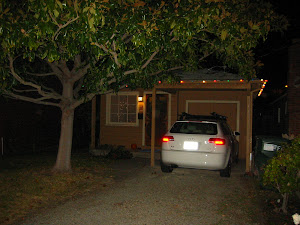
After all that description, here are a few pictures of it after the first coat:


OK, time to go start the second coat!


No comments:
Post a Comment